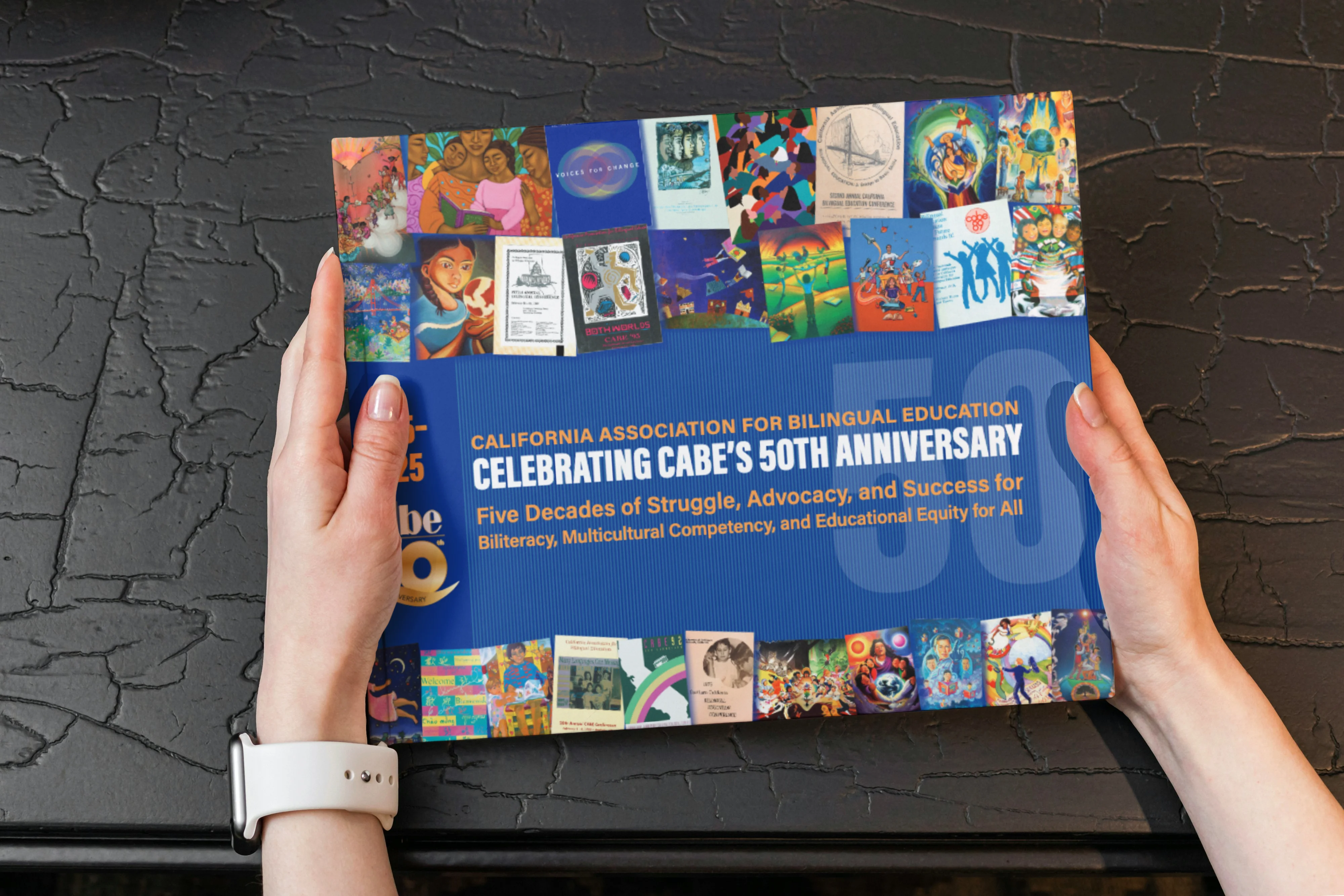
Books are powerful messengers for your customers. The written word is one obvious way, but the packaging of words subconsciously tells your buyer much more about you and your company.
It’s not just making your words pretty. Packaging is a sophisticated design process that is often passed over in favor of saving money.
That is a critical error. Prospects might open the book, but the design horror show inside will turn off even your most interested sales lead.
The before/after you see below is a great example of how design can send critical subconscious messages about content.
The cover on the left used an amateurish color palette with flat text on the front and back covers.


A professional redesign used richer colors and a sophisticated font. It obliterated the unwritten “shlock consultant” message in favor of a sophisticated and professional impression.
When you’re weighing costs, remember this: Lower cost production solutions most readily found on the web can be very inexpensive, but you also end up with something that doesn’t present your product/business/service well.
Those months you spent writing and editing? Wasted.
You don’t paint your own car. You didn’t make your golf clubs. Your precious content deserves the very best presentation possible. Invest in good design and watch your content sell itself and your business.


